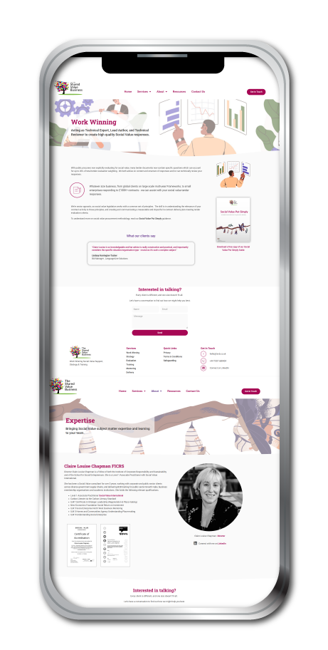
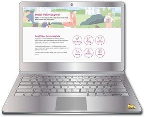
I worked closely with the client to understand what felt wrong with the original website and what she wanted the new version to communicate. From there, I developed a new visual direction, improved the website structure and rebuilt all web pages so the finished site felt more attractive, accessible and easier to navigate. The steps I took to create a whole new look for this website were:
Choosing complementary brand colours and checking them for web accessibility
Selecting complementary heading and body fonts for use across the website
Creating bespoke service icons in the refreshed brand colours
Editing stock images for use as professional website banner images
Restructuring the website site map to improve the user journey
Creating a new site menu and footer to display across the website
Rebuilding each webpage using the client’s copy, new imagery and clear calls to action
Updating the design of a key client download document so it matched the refreshed website style
The finished website gave the client a more professional online presence, improved user experience and made her services easier to understand. The refreshed colour palette, typography, imagery and icons created a beautiful and cohesive brand experience. The improved site map and page layouts made the website easier for visitors to explore. The client was delighted and felt the new website reflected her business values far more clearly.