A logo is often one of the first things people notice about a business. A well designed logo helps create recognition, build trust and makes marketing consistent and professional. In our initial discussion, I explored the client’s goals, audience and existing brand. From that conversation, I developed a concept based on the tree of knowledge, a positive symbol that connected learning and growth.
Created initial hand-drawn logo sketches to explore the strongest visual direction before moving into digital design.
Translated the approved concept into digital artwork using graphic design software, working within the existing colour palette and font guidelines.
Refined the design and presented the final logo concept for the client could review and approve
Delivered the finished logo in suitable digital formats for web, social media, print and promotional use.
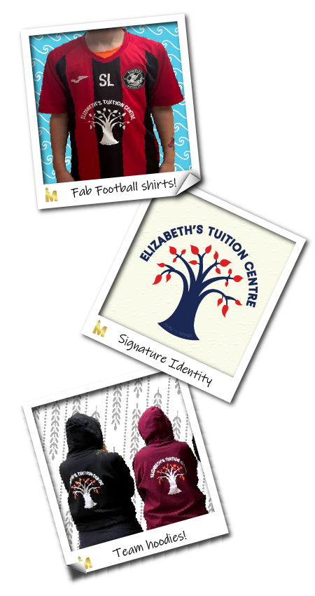
The final logo gave Elizabeth’s Tuition Centre a warm, recognisable identity for its new website and wider marketing. It now appears across the centre’s digital channels, printed materials and local football team sponsorship, including on team shirts. The client was delighted with the result because the logo felt true to the centre’s personality while being practical enough to use across different formats. This project brought together client consultation, creative concept development, brand identity, digital artwork preparation and practical marketing thinking. As a freelance marketing manager, I focus on creating work that not only looks good but also supports the wider customer experience and business goals.